Sunday 22 March 2015

Analog(ue?) Photography


Last week we were introduced to the college's analog cameras for the first time! I was well excited. I've been using my mum's DSLR for a few years now and feel quite comfortable with a camera but I've never actually had a go with a film one (after an incident where I ruined all of my family's millenium photos out when I was 2..  we don't talk about that.).


A 'Contact sheet' made of many film negatives from the camera.
This is just like the the thumbnails of photos on your computer!
In the first week we took photos around the college grounds then developed them like the photograms we made. This left us with a long developed film waiting to be turned into a contact sheet which we then did earlier this week. This involved sandwiching the negatives between photosensitive paper and glass then shining light through to get a small version of all the photos. 
'Pityas and Daffodil' -I joked that thic could be in a fashion magazine then realised it really could be.
A few days ago we went out to take portrait photographs of classmates in different lighting then we got to enlarge them to a proper photo size. I really really enjoyed this process in the dark room. I definitely want to do this again!


I think that this photograph of my classmate, Pityas is actually beautiful. The white light and the way his jumper seems to glow gives him and almost angellic feeling. The soft focus on the tree behind him turned out brilliantly in my opinion. I am honestly considering sending this photo to a modelling agency for Pityas. He has the 'model look' perfected!
And finally, here's a dramatic photo of myself, taken by Pityas (who's not just a nice face)

I must admit I like the scratches and marks left from the processing of the photo.
Ultimately, I had a really good time and learnt a lot. Which is what matters. I definitely want to do more of this.

Photograms


Two of these are by Man-ray, one is by me.
I thought they looked good together, can you tell which is mine?
 We did photograms a few weeks ago now. Photograms are made in the dark room by projecting light onto photosensitive paper then developing the paper. The shadows caused by objects places on the paper stay white. Areas where the light hit the paper turn out black.

First, we made test strips by exposing the paper to two seconds of light then slightly covering it, exposing it for another two seconds and repeating along the strip. What should come out is a strip with about 5 or 6 obvious shades of monochrome. What I got was mostly black. We repeated the process but with only 0.5 seconds of exposure time per covering. That turned out very well! Sing the test strip we could tell that three to four seconds was the perfect exposure time to get a perfect black.


Various experiments using various objects including glass prisms and a slide carousel for a projector.
I really love how crisply the stripes in the top two images turned out.
We started getting creatively instantly when allowed to make our own photograms! The Dark room has a very exciting feel to it with the dark lights, projectors and chemicals that makes photographs magically appear a bit like Harry Potter. We photogrammed whatever we could get our hands on; Photography equipment, light bulbs, other classmate's glasses, even our own hands!
Once again, I've mixed together my own work and that of Man-Ray and László Moholy-Nagy.
This time, there's a theme of stripes!
The process is hugely experimental, quick and very gratifying, I find. It is no wonder surrealist artists such as Man-Ray jumped on it to start producing ambiguous monochrome arrangements out of household objects. I can definitely see myself wanting to do this process again in the future!


Painting


After the first two painting lessons (which involved painting crumpled up pieces of paper and mixing shades of grey) we were pretty much given free choice of what we wanted to paint (with the light theme in mind) but were told to aim for at least a handful of A3s and a few small samples.
These are each postcard sized.
These are my concept paintings. I like how the sunset turned out, I like sunsets. But who doesn't?

I liked the two light men on the left a lot. They're inspired by an idea I had a few years ago about people who could control and bend light at their will. I decided I wanted to bring those paintings up to a bigger size. But first I made a few other experiments but on A3 paper:
Top: I've used an overhead projector quite a lot in this project so I figured I'd paint one!
Bottom: This is ispired by an image I printed onto acetate for typography
After doing those two, I decided I was ready to paint the light men on a big piece of paper.


The painting on the left was the first I made. The.. bulge is unfortunate and I hadn't actually noticed it when I was painting it, otherwise I would have fixed that. My brushing technique wasn't very good, either. I was using the same sized brush but on big pieces of paper now, this was quite different. I liked my second attempt quite a lot more (on the right). I experimented more with flicking paint onto the paper and tried to make sure my brush was more wet and fluid in general. Here's a photo up close:

These painting are partially inspired by the light painting I did a few weeks ago as well as photographs I found of people interacting with the work of Anthony Mccall;
Anthony Mccall
'Line describing a cone' -Anthony Mccall


After researching these inspirations and looking back at what I'd made, I decided that I wanted my final painting to show the light man interacting with the light even more, like it is an extension of himself.


Wow, yes! That's it!
I'm really chuffed with this painting, I decided to scale the man down on the paper because I wanted space for the light. I also think the brush textures look best on a smaller painting. I let the shape of the light come naturally by daubing my brush around semi-randomly before creating loose tendrils of pastel colour. Quite a few people in my class complimented me on it, 'That's really wicked, Dom' 'When I live in my swanky apartment in LA, I want a big version of that painting on my wall!'
I enjoyed making these paintings and felt that I learnt quite a lot even though we were mostly left to our own devices. It's very cool to look at my little concept painting next to my finished piece, now. I'm rather proud of it! :)

4D mini project


'Hypercube'- a hand drawn animation by myself about the 4th dimension
When I heard we were going to have a mini project at college about animation/moving image titled '4D' I got very excited; I have been interested in animation since I learnt how to bring life to lumps of plastecine and lego using a camera and computer. The 4th dimension is another fascination of mine and I have made work based on it before (See animation above). There's quite a few animations on this blog already and there are many .gifs on my website!

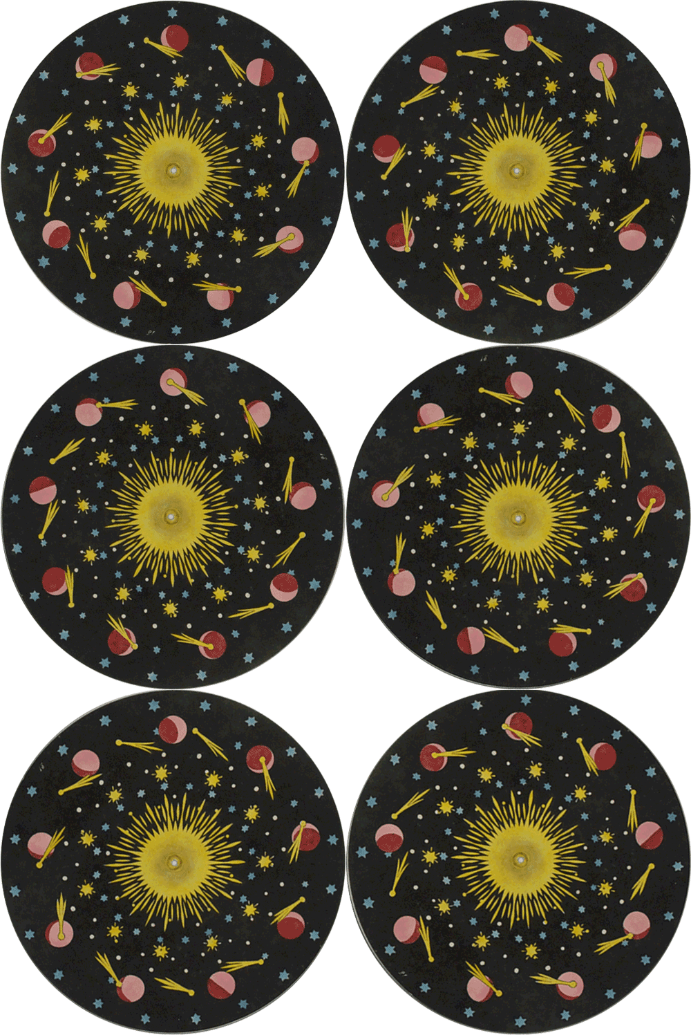
scope.jpg               Phenakistoscope_3g07690b.gif


In the first week we were shown examples of traditional animation: Flipbooks and zoetropes. I'm quite familiar with both due to museum visits and a general interest in animation. We were asked to research other early forms of animation. I remembered seeing an article about a digital museum of 'Phenakistoscopes' and other optical tricks from the 19th century that I thought would be very suitable. I manged to track down the article and carried out further research.
What really fascinated me about Zoetropes, Phenakistocopes, praxinoscopes, electrotachyscopes and other disc based animation techniques was their looping nature. They're actually very similar to animated gifs that myself and others make! Looping animation actually existed over half a decade before film. And that, to me, is really interesting, especially considering how popular gifs are today.
I can imagine a victorian staring into a spinning drum to watch small loops of kittens and 'fails' 
(wait that's actually what they did!) 


You can see the amazing collection of Phenakistoscopes and other 19th centrury animation techniques on www.dickbalzer.com which is a digital museum owned by Richard Balzer, a collector.
phenakistoscope-4.gif


In the second week we had to form groups and were given cameras then asked to shoot fast sequences of photos to be stitched together into a video. This is very similar to simply taking a video with the camera except there's less frames. This didn't make much sense to me because it didn't really take advantage of what you can do if you take photos then stitch them into a video. By taking a photograph then moving objects in the shot then repeating that quite a few times you can make yourself a stop motion animation! I wanted to make a stop motion animation. To do that you need a tripod to keep the camera steady between frames. We were told we weren't allowed a tripod as those aren't required to take a sequence of photographs. I was a bit annoyed. Oh well. we made some stop motion videos anyway at much complaint from whomever was unlucky enought to be the cameraman who had to keep the camera as still as possible for a rather long time. This is what we produced:
Using the magic of animation I was able to slide around without walking!
If I were to make this again, I'd make sure to communicate with the camerawoman about where the edges of the frame are as I went off the side here.
I used an anti camera shake filter on adobe premiere pro to give this animation a smooth camera motion..
Stop motion takes quite a lot of time to make.
You can see that demonstarated quite clearly here if you look at the shadows.
These were all made in a lesson so that's actually pretty fast. They were all a pretty good introduction to bringing objects to life which led on very well to what we did in the third week... 

Thursday 12 March 2015

Typography


We're on the penultimate week of the 2D Light project and I have a small back log of work to publish here from various subjects; photography, printmaking, life drawing, painting and typography. Today I'm showing you the progress I've made in my typography class!


Light cutout over lens and over light box.
Other people in my class decided to use other words related to the theme because they decided 'Light' was too boring. That's fair enough, but I'm not really bothered about the words, just the techniques which can be applied to other forms of media. My experimentation with cutouts, projection and shadows can be used in photography, fine art, sculpture, textiles or whatever you can think of.
This sequence of photos represent my interest in type rather well.. heh.
Here I explored the capabilites of offcut pieces of card, first I made a word using them but quicky became more interested in the more abstract arrangements. They remind me of an artist but I can't remeber their name so that's no use.
I am interested in typography and have used it in album artwork and acknowledge it's importance but I feel the class at college could do with a wider, more graphics or visual communication approach.


From top down: Light, Light and Light.

I really enjoy projection (if you hadn't noticed already), I see a lot of potential for projection in my own work. I'd like to project something onto a band and make live visuals or a music video. So I've been making the most of the opportunities in college to experiment with it!
I was vcery excited to discover that we have the facilities to print onto acetate used for projection. I'll be putting pictures of that up here next week, I hope you're looking forward to that. Be excited!